In this blog, we will explore how to design the best newsletter landing page to double your subscribers using the free Kadence Blocks plugin. This guide will provide a step-by-step overview of the design process, key features, and tips to enhance your page.
Introduction to Newsletter Landing Pages
Creating an effective newsletter landing page is crucial for capturing leads and building your subscriber list. A well-designed landing page not only attracts visitors but also persuades them to take action. The goal is to convert visitors into subscribers through compelling visuals and clear calls to action.
To maximize your conversion rates, it’s essential to focus on user experience and aesthetics. A minimalist design often works best, allowing your message to shine through without distractions. By implementing the right strategies, you can ensure that your Newsletter Landing Page will Double Your Subscribers.
Why Shane Malak’s Design?
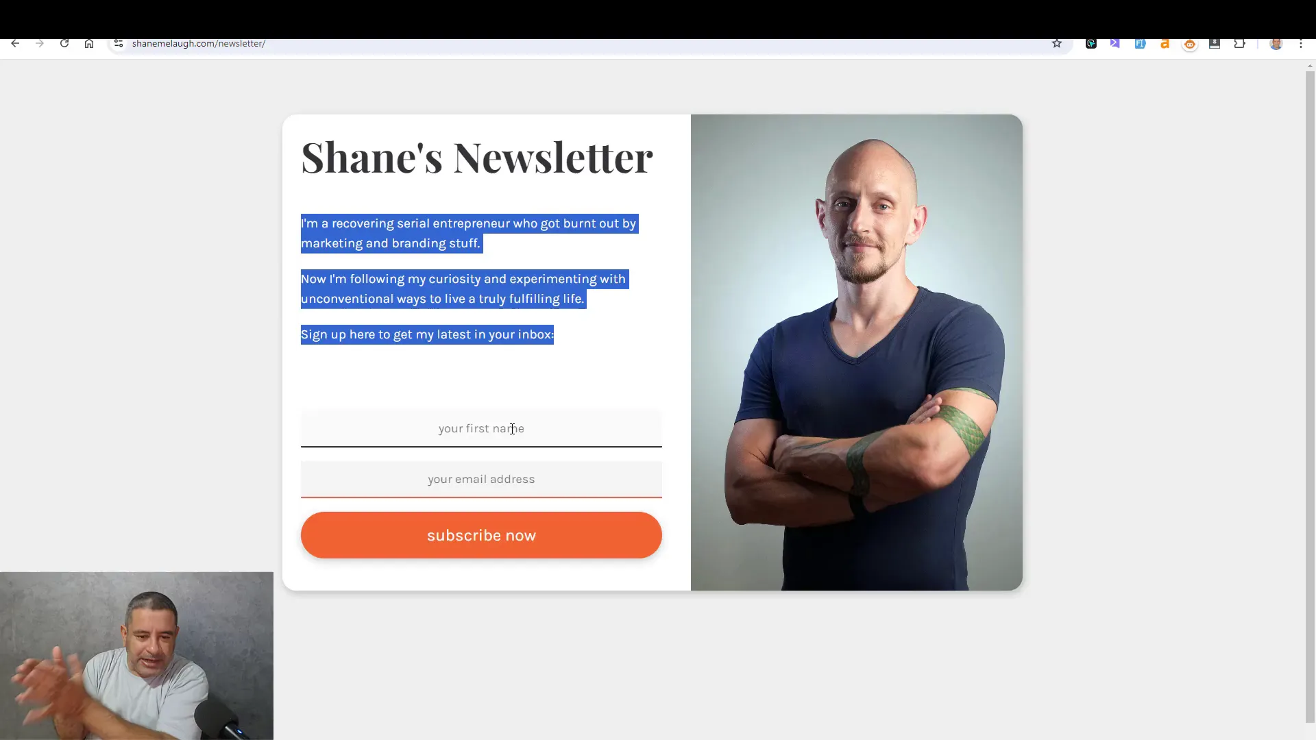
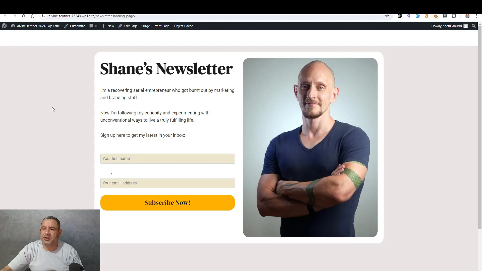
Shane Malak’s design philosophy emphasizes simplicity and effectiveness. His landing page features a personal touch with a professional image and a clear layout. This approach helps in establishing trust and encourages visitors to subscribe.
By adopting Shane’s design principles, you can create an inviting atmosphere that resonates with your audience. Key elements include a clean background, straightforward text, and a prominent subscription form. Such a design not only captures attention but also makes the user journey easier, leading to higher conversion rates.
Installing Kadence Blocks Plugin
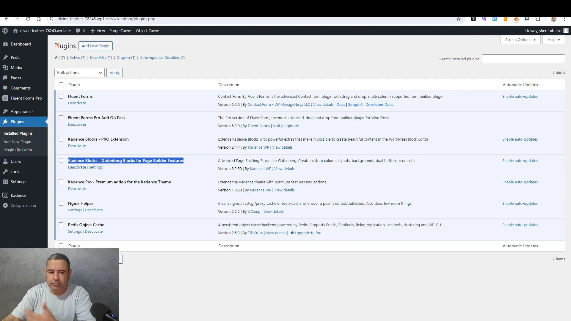
The first step in creating your newsletter landing page is to install the Kadence Blocks plugin. This free plugin offers a variety of features that enhance your WordPress site, allowing for custom layouts and designs tailored to your needs.
To install the plugin, navigate to the ‘Plugins’ section of your WordPress dashboard. Click on ‘Add New’ and type ‘Kadence Blocks’ in the search bar. Once you find it, click ‘Install Now’ and then ‘Activate’. This plugin will provide you with the necessary tools to design your landing page effectively.
Setting Up the Landing Page Structure
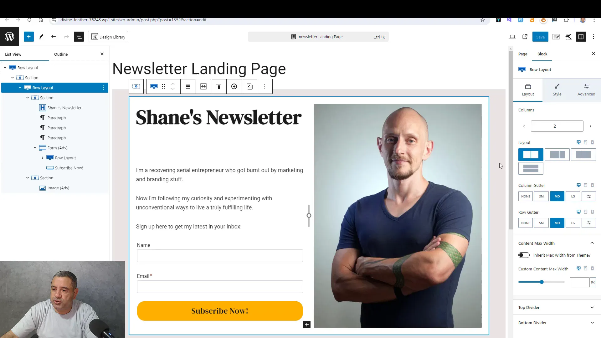
After installing the Kadence Blocks plugin, it’s time to set up the structure of your landing page. Start by adding a new page in WordPress. Choose a blank template if available, as this will give you a clean slate to work with.
Begin by adding a one-column row. This will serve as your main section. Next, you can add a two-column row to incorporate additional elements, such as images and text. This structure allows for flexibility in design and helps in organizing content effectively.
Designing the Background and Layout
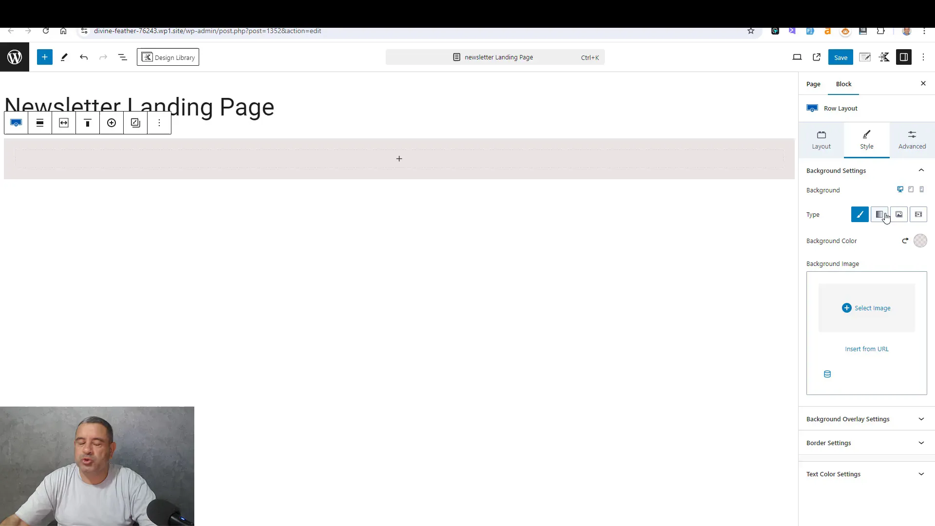
Designing the background is crucial for setting the tone of your landing page. For a minimalist aesthetic, consider using a gray backdrop for the main section. This will help your content stand out and maintain focus on the call to action.
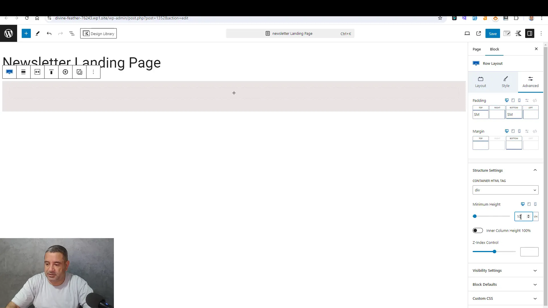
To adjust the background color, go to the row settings and select the color option. You may also want to increase transparency for a softer look. Additionally, ensure that the row stretches across the full height of the screen to create a more immersive experience.
Adding Images and Text
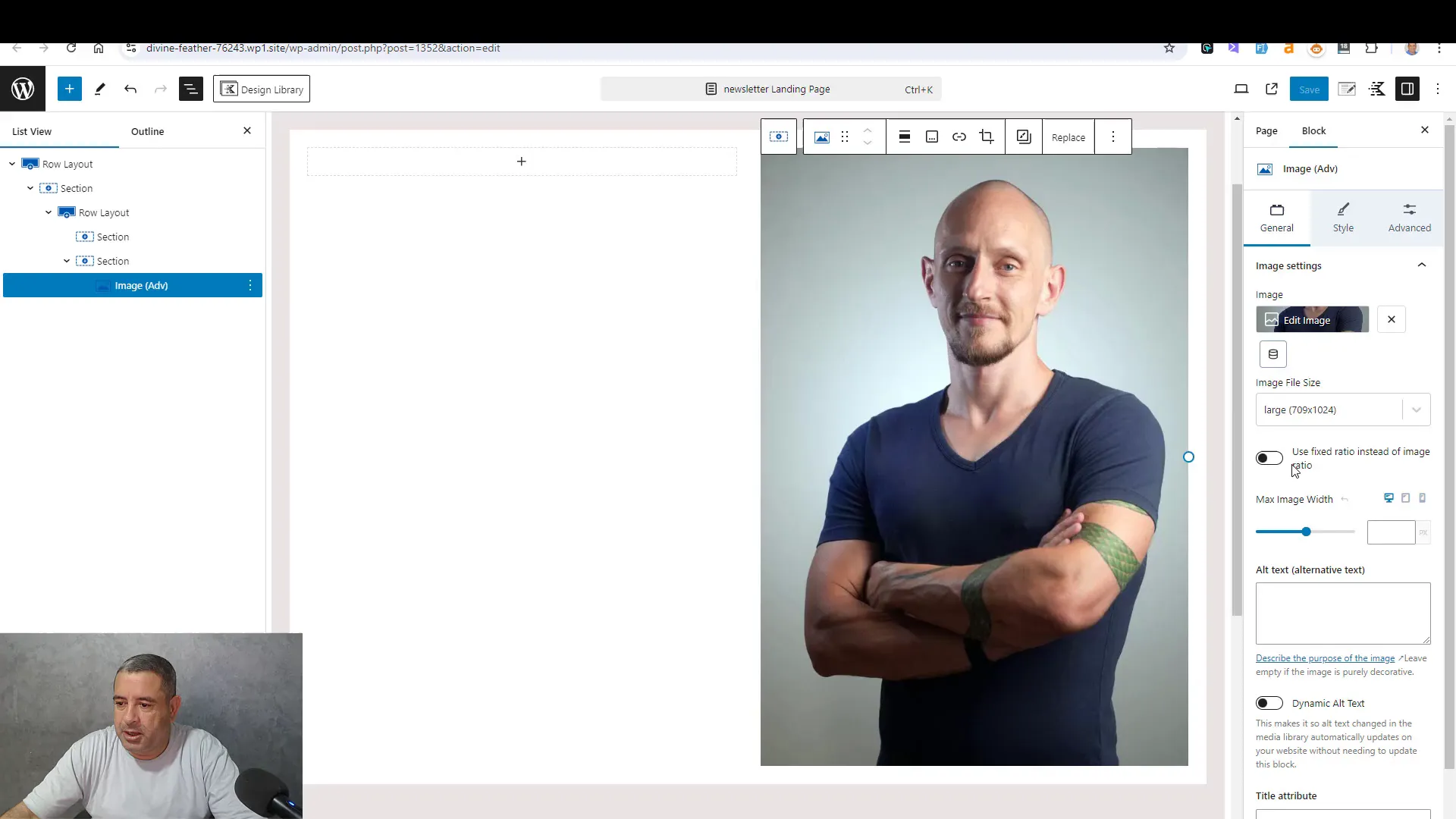
Once your background is set, it’s time to add images and text to your landing page. Incorporating a professional image can significantly enhance the personal touch of your page. Select an image block and upload your chosen image.
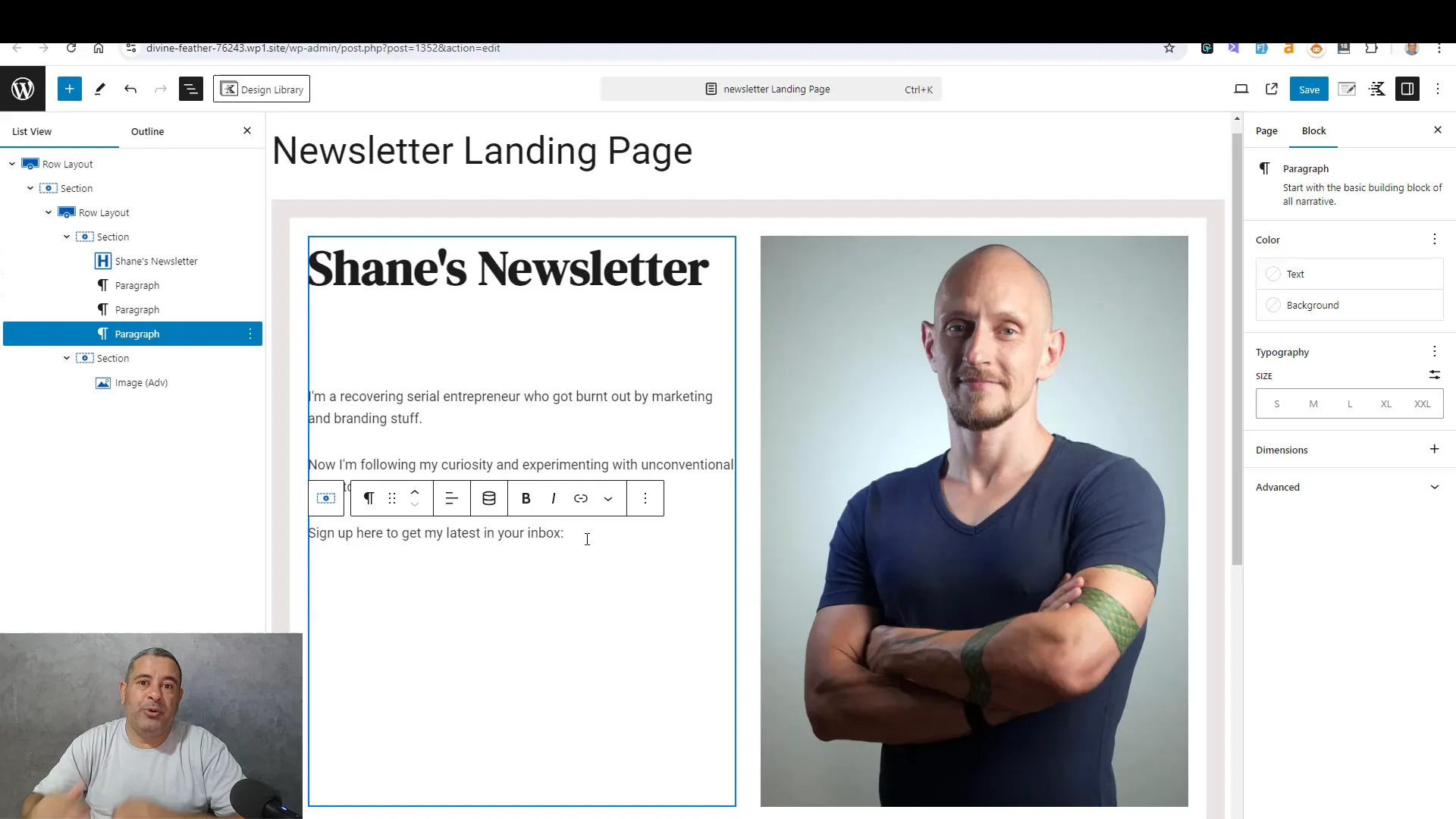
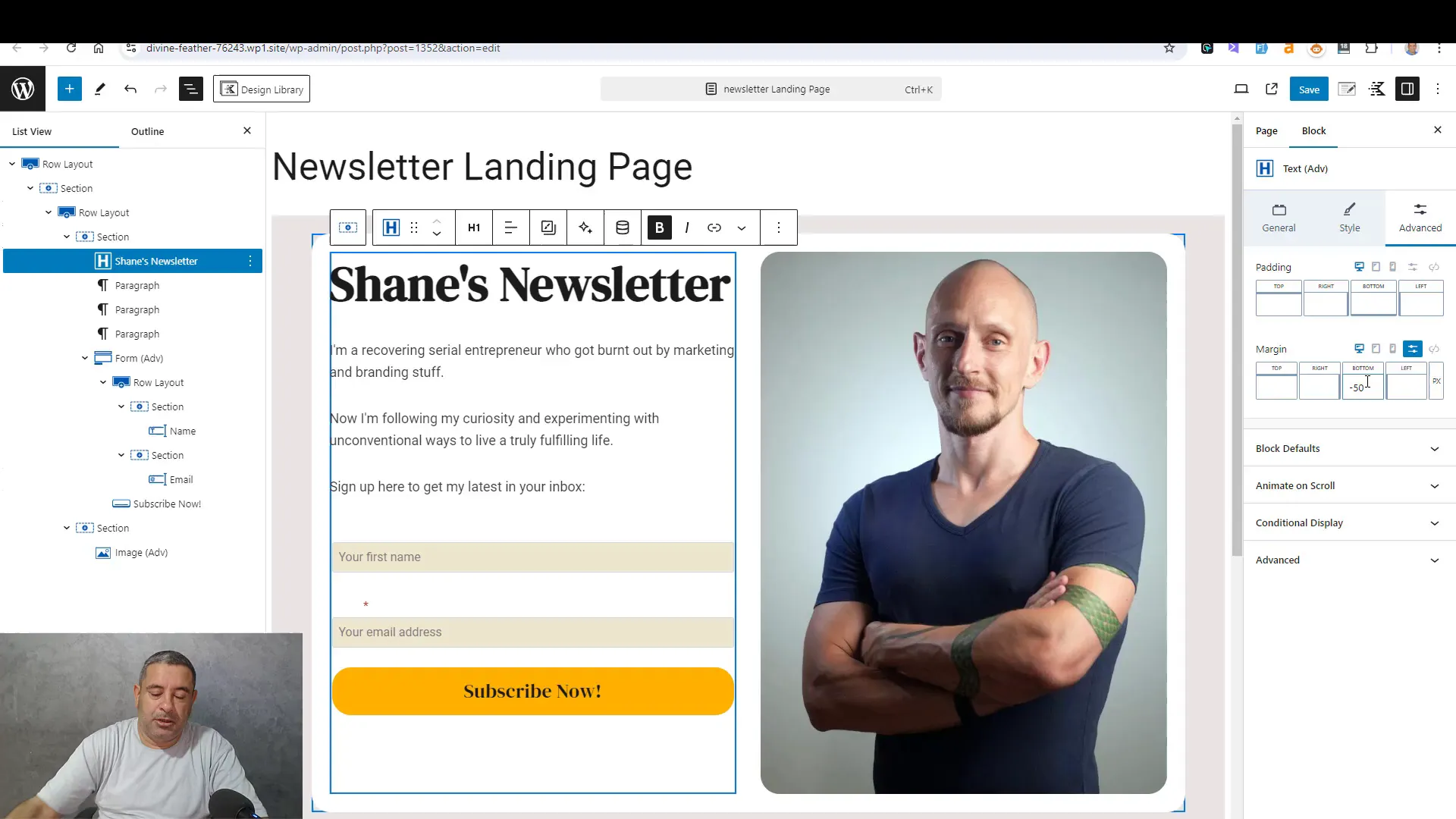
Next, add text blocks for your headlines and descriptions. Use larger font sizes for headings to grab attention. Ensure that your text is concise and directly related to the benefits of subscribing to your newsletter. This clarity will encourage visitors to engage with your content.
Creating the Subscription Form
The subscription form is one of the most critical components of your newsletter landing page. It serves as the gateway for visitors to become subscribers. Using the Kadence Blocks plugin, you can easily create a form that is both functional and visually appealing.
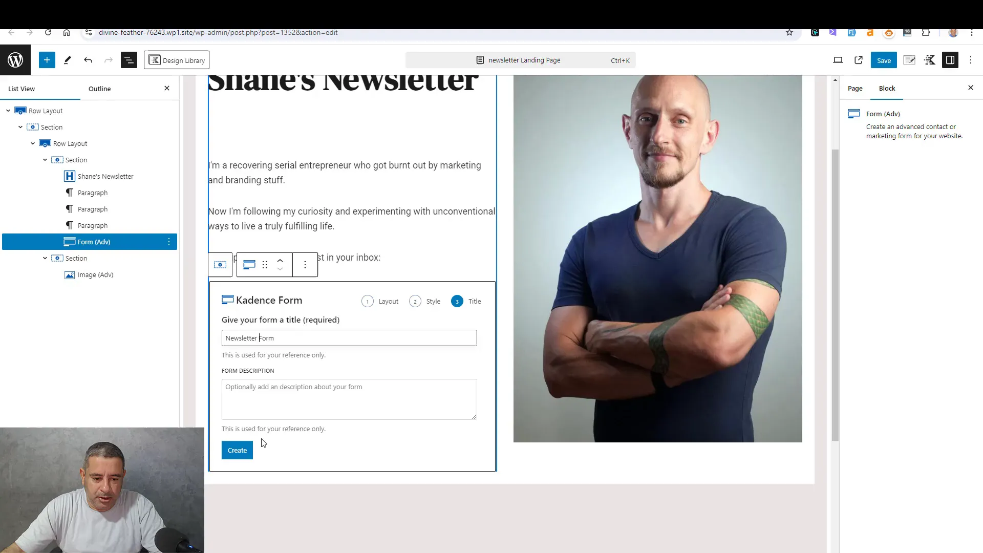
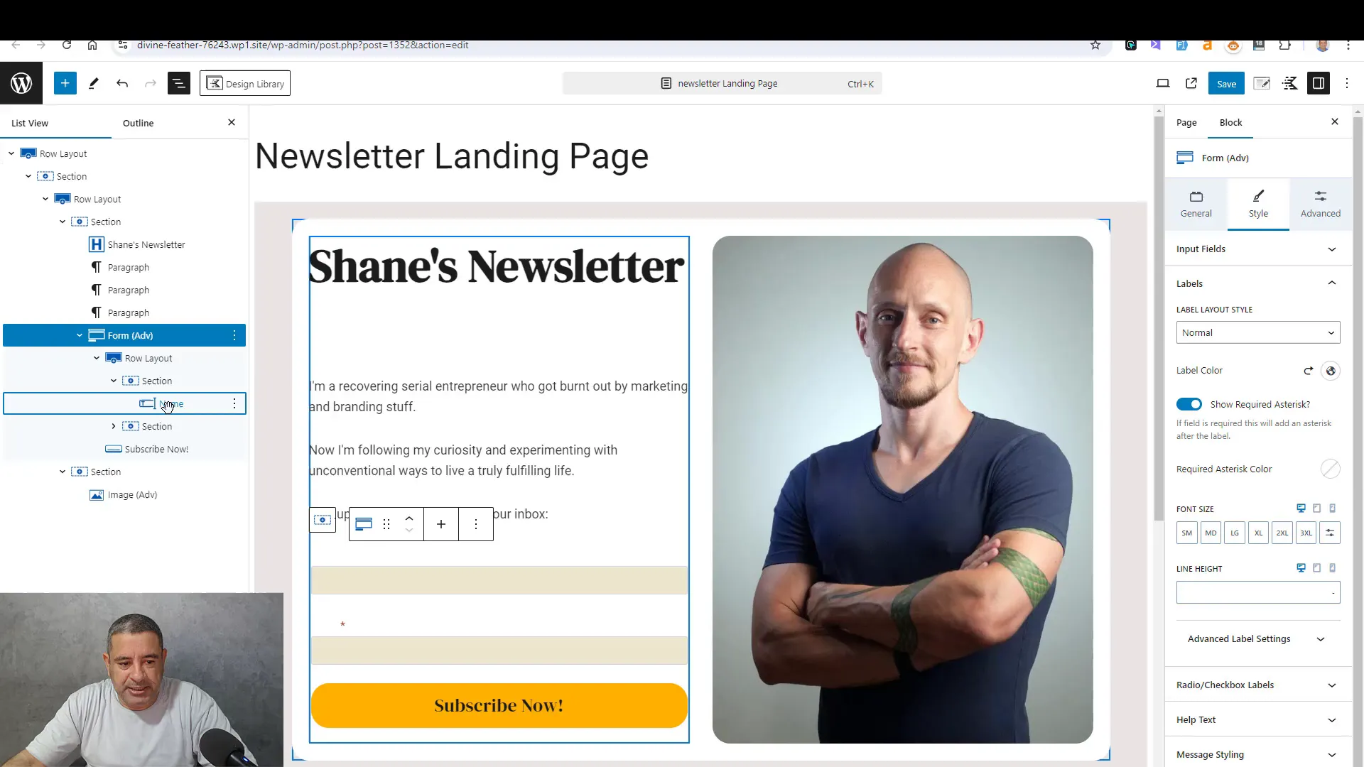
To create your subscription form, start by adding a new block to your landing page. Select the form block from the Kadence Blocks options. You will be presented with different layout options; choose one that captures both the name and email fields, as these are essential for effective subscriber management.
Customizing the Form Fields
After selecting the layout, customize the fields to suit your needs. Label the fields clearly, such as “Your First Name” for the name field and “Your Email Address” for the email field. This clarity helps users understand what information they need to provide, increasing the likelihood of form completion.
It’s also essential to adjust the placeholder text. This text should provide an example of what to enter, making the form more user-friendly. For instance, use placeholders like “Enter your first name” and “Enter your email address.”
Styling the Form and Button
Styling is vital for creating an attractive subscription form. Start by selecting the form block and navigating to the style settings. Here, you can adjust the background color, border, and padding to make the form visually appealing.
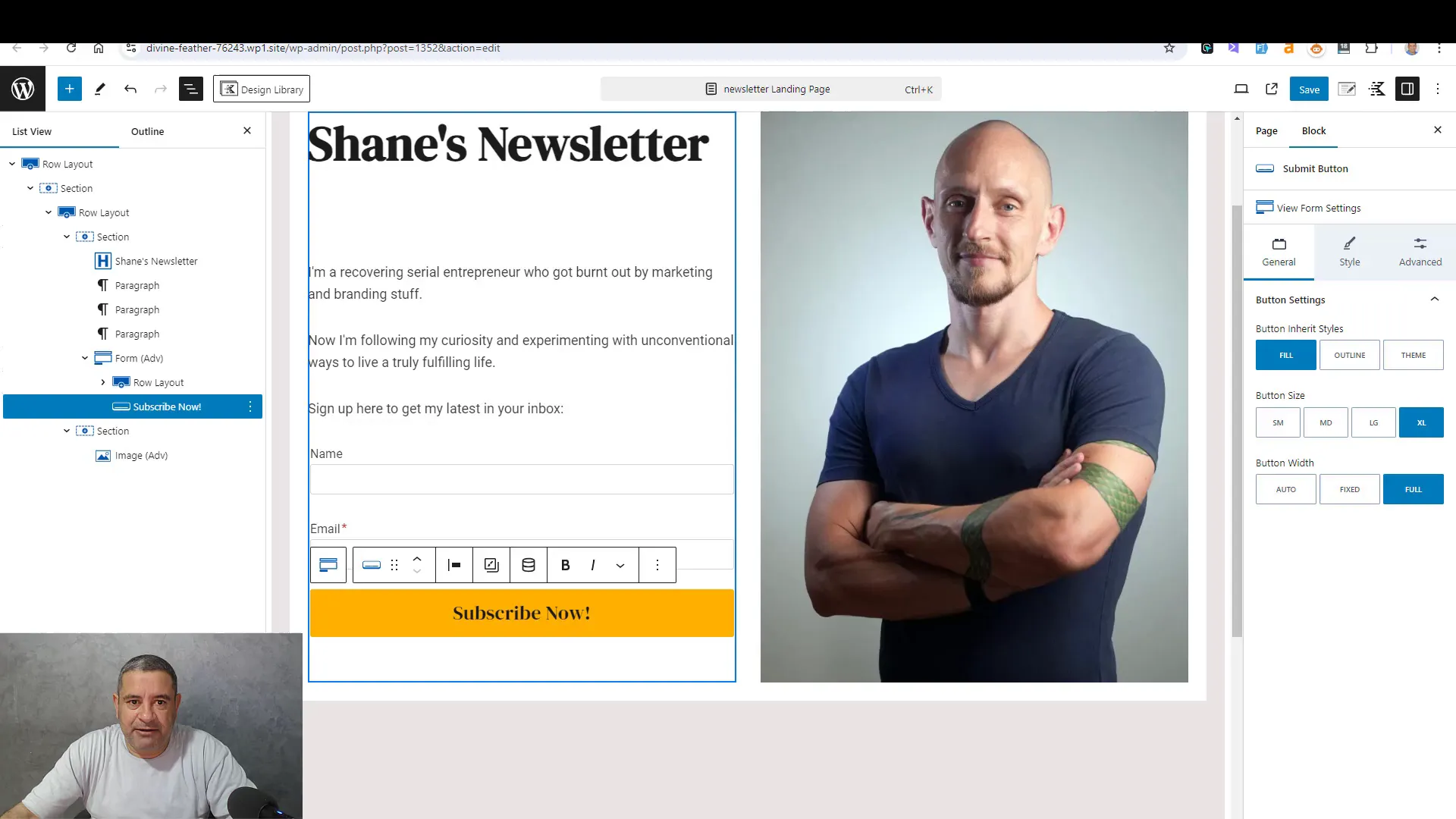
For the submit button, choose a color that stands out against the form background. This contrast draws attention and encourages users to click. You can also round the corners of the button for a more modern look by adjusting the border radius.
Responsive Design Considerations
Ensure that your form is responsive, meaning it should look good on both desktop and mobile devices. Test the form on various screen sizes and adjust the widths accordingly. A mobile-friendly form will significantly improve user experience and increase conversion rates.
Additionally, consider the font size and button size. They should be large enough to be easily clickable on mobile devices, ensuring that users can engage with your form effortlessly.
Final Adjustments and Preview
Before publishing your landing page, take a moment to make final adjustments. Review the overall layout, ensuring that each section flows smoothly into the next. Check the alignment of text and images, ensuring everything looks professional.
Preview the page in different browsers and on various devices to catch any discrepancies. Pay attention to loading times as well; a fast-loading page enhances user experience and keeps visitors engaged.
Testing the Subscription Process
Once you’re satisfied with the design, it’s crucial to test the subscription process. Fill out the form yourself to ensure that submissions are processed correctly. Check your email to confirm that you receive a welcome message or any follow-up communication you’ve set up.
Testing the form will help identify any issues before your audience interacts with it, ensuring a seamless experience for new subscribers.
Comparing with Best Practices
To ensure your newsletter landing page is effective, compare your design and strategies with industry best practices. Successful landing pages often feature clear and concise messaging, strong visuals, and an appealing call to action.
- Clear Call to Action: Your call to action should be direct and persuasive. Use action-oriented language like “Subscribe Now” or “Join Our Community.”
- Minimal Distractions: Avoid cluttering the page with unnecessary elements. A clean design helps focus attention on the subscription form.
- Social Proof: Consider adding testimonials or subscriber counts to build trust. People are more likely to subscribe if they see others have benefited.
Conclusion and Recommendations
Creating an effective newsletter landing page involves more than just aesthetics; it requires strategic planning and execution. By utilizing the Kadence Blocks plugin, you can design a page that not only looks professional but also effectively converts visitors into subscribers.
As you finalize your page, remember to continuously test and optimize. Monitor your subscription rates and make adjustments based on user feedback. The goal is to create a streamlined experience that encourages visitors to subscribe to your newsletter.
FAQ
